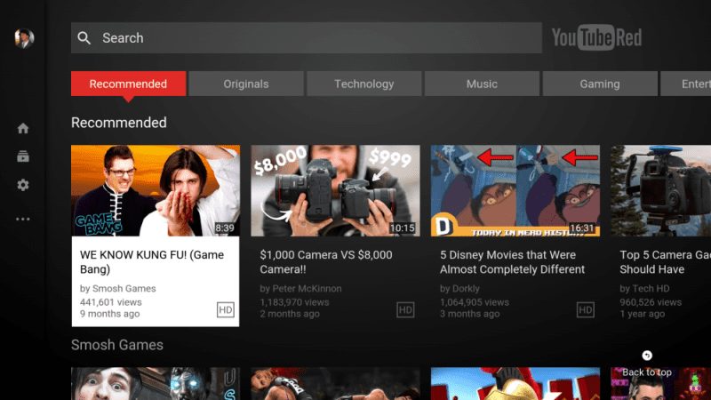
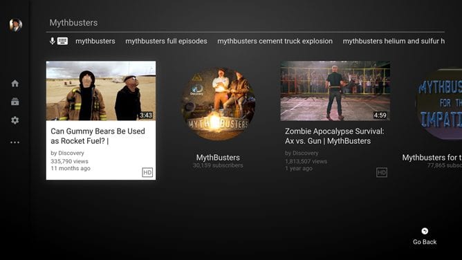
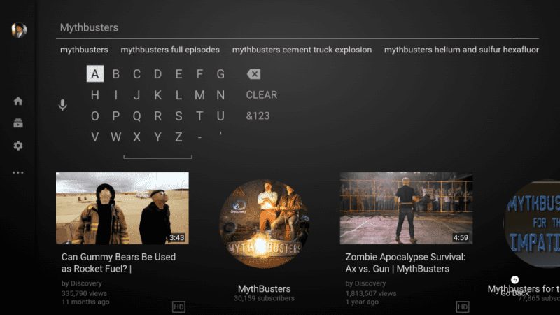
Moving On the sidebar, the watch section has been moved so there is fewer section found. The main screen has a list of videos horizontally placed before it was vertical. The white color is used as a highlight color with the darker background. This is a new design that the Youtube Tv app brings with it. From the top of the Home screen there is a row of topical areas, starting with your own recommendations and other YouTube Red Originals, then following a list of broad topics like Food, Beauty, travel and Gaming. Similar changes have been had been done in the search box interface. The new interface brings all suggestions in more convenient order.
2. Video Player:
3. Settings:
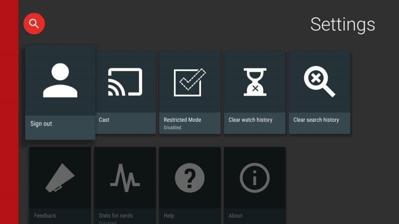
In the settings, there are few tweaks done here and there. The position of the red bar has been updated. The new settings are the long row which is spanning towards the right side.
4. Download:
The apk is released by Google along with certificate installation will be available in the later period of time after few days. but if you want to try it now we have given the link from apk mirror do try it. Version: 2.00.16
APK Mirror
OR you can download the Official App From Here: [appbox googleplay com.google.android.youtube.tv] So, guys do try out the new Youtube TV feature and tell us what do you think about this new features. Thanks for reading our article and we hope you have a great day.
